Cluster and Principal Component Analysis
In the first part of this tutorial we shall imagine ourselves in
a satellite taking
photographs of the earth. In the process we shall learn some
image processing as well as some clustering techniques.
 |
| A satellite image |
This shows part of a blue ocean and two land
masses with some green vegetation. We can recognize these by the
color. A human eye is extremely adept at detecting large regions of
similar colors in an image. A camera, however, has no such
ability. It
merely scans a scene in a mechanical way, faithfully reporting every dot
in it, but has no idea if the dots constitute any pattern or not. The
above image, for example, is made of 3000 dots, arranged in a rectangle
that is 75 dots wide and 40 dots high. Each dot, by the way, is
called a pixel (a short form for "picture element"). The
camera uses three filters: red,
green and blue. The camera reports the red-ness, green-ness
and blue-ness of each pixel. The numbers are from 0 to 255. Thus, a perfectly
red dot will have red value 255, green value 0 and blue value 0. If you
increase the green component the dot will appear yellowish (since red plus
green light make yellow light).
The 3000 dots in our pictures, therefore, are just 9000 numbers to the
satellite. It is better to think of them as 3000 points in
3D. Our eye could quickly group (or cluster) these 3000 points
into two clusters: ocean and land. The ability to group a
large number of points in d-dimensions into a relatively
smaller number of classes is the aim of cluster analysis.
The file sat.dat stores the data set for this image. Before
going into the statistics let us learn how to turn these 3000
points into an image using R.
First read the data.
dat = read.table("sat.dat")
Notice that this file has no header line, so we have the omitted
the usual head=T option. We are told that the data
file has 3 columns and 3000 rows of numbers. Each row is for a
pixel, and the 3 columns are for red, green and blue,
respectively. Let us assign these names to the columns.
names(dat) = c("red","green","blue")
attach(dat)
Next make a vector of colours, one colour for each point.
mycol = rgb(red,green,blue,max=255)
The function rgb makes colours by combining red,
green and blue values. The max
specification means 255 is to be considered the highest value for
each colour.
Next we need to specify the size of the image. It is 75 pixels in
width and 40
pixels in height.
rows = 1:75
columns = 1:40
So the 3000 points are actually arranged as a 40 by 75
matrix. (The height, 40, is the number of rows.)
z = matrix(1:3000,nrow=75)
Now we are ready to make the image.
image(rows,columns,z,col=mycol)
If you do not like to see the axes and labels, then you may
remove them
using
image(rows,columns,z,col=mycol,bty="n",yaxt="n",xaxt="n",xlab="",ylab="")
Based on the 3000 points
the statistical brain of the satellite has to decide that is seeing two
land masses peeping out from a vast blue ocean. And one important tool to
achieve this is called clustering.
But before we go into it let us make a 3D scatterplot out of the 3
variables.
library(scatterplot3d) #Warning! It won't work at IIA.
                       #I mention this to explain how
                       #you may do it if you can download
                       #this (pretty large) package.
                       #Also, this package is readily available for
                       #only Windows. To use it in Linux, you have
                       #to download the source code and compile!
                       #But we shall see a work around for this soon.
Then you can use:
scatterplot3d(red,green,blue,color=mycol)
But, as I mentioned just now, the above will not work for Linux. So here is a simple workaround. First download
the small script scat3d.r. Now use
source("scat3d.r")
scat3d(red,green,blue,col=mycol)
You can also turn the plot around specifying the angles theta and phi as follows.
scat3d(red,gren,blue,col=mycol,theta = 20, phi=0)
Just a jumble of points, right? We shall apply a technique called
k-means clustering to group the 3000 points into 2
clusters. Then later we shall learn how k-means clustering
works.
cl = kmeans(dat,2)
Let us see what kmeans has returned.
names(cl)
cl$clus
Each pixel is put into one of two clusters (called 1 and 2), and
cl$clus tells us the cluster of each pixel. The
centres of the two clusters are given by
cl$center
Now we shall make an image of the clustering result. We are going
to have an image consisting of only two colours, one for each
cluster. It is natural to choose the centre as the representative
colour for a cluster.
c2 = rgb(cl$cen[,1],cl$cen[,2],cl$cen[,3],max=255)
c2
Next
we have to wrap the long vector cl$clus in to a 75
by 40 matrix in order to make the image.
image(rows,columns, matrix(cl$clus,75,40),col=c2)
Do you think that the ocean is well-separated from the land?
What about adding some more details? For this we shall increase
k to 3, say.
cl = kmeans(dat,3)
c3 = rgb(cl$cen[,1],cl$cen[,2],cl$cen[,3],max=255)
image(rows,columns, matrix(cl$clus,75,40),col=c3)
As you increase the number of clusters more and more details are
added to the image. Notice that in our example the details get
added to the land masses instead of the ocean which is just a
flat uninteresting sheet of water.
How the k-means algorithm works
Consider the data set shown below. We can see that it has two
clusters of points.
 |
| Want to find the two clusters |
In order to find these two clusters we shall employ the
k-means algorithm with k=2.
The algorithm proceeds by alternating two steps that we shall
call Monarchy and Democracy (see the figure below). In step 1, we apply Monarchy by
choosing two random points as the kings of the two
clusters. These two kings create their empires by enlisting the
data points nearest to them as their subjects. So we get two
kingdoms separated by the perpendicular bisector between the
kings.
In step 2 we have Democracy, where the king is abolished and the
data points in each kingdom choose their respective leaders as
the average of themselves.
This election over, Monarchy kicks in once again as the elected
leaders behave as kings, enlisting the nearest data points as
subjects. This redefines the boundary of the kingdoms.
Then Democracy starts again, after which comes Monarchy. This
process continues until the kingdoms do not change any
more. These two kingdoms finally give the two clusters. The kings
(or elected leaders) are the centres of the clusters.
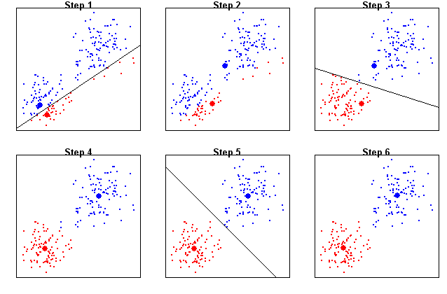 |
| Steps in the 2-means algorithm |
Hierarchical clustering
Since the amount of details increases with a larger number of
clusters, we come to the question ``How to choose the best
number of clusters?" One way to resolve the issue is to first take a look
at the results for all possible numbers of clusters. Clearly, if
there are n cases in the data, then the number of clusters can go
from 1 to n. This is the idea behind hierarchical clustering. It is
like zooming down gradually on the details.
Consider the four shapes below.
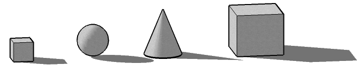 |
| Group these |
Suppose that you are to group the similar shapes together making just
two
clusters. You'd most possibly put the two cubes in one cluster, while the
sphere and the cone (both having round surfaces) will make the second
cluster. So the two clusters are
(small cube, large cube) , (sphere, cone).
Next, suppose that you are to further split any one of the
clusters (making three clusters in all). One natural way is to
split the (sphere, cone) cluster into two separate clusters (sphere) and
(cone) resulting in three clusters:
(small cube, large cube) , (sphere), (cone).
If we are to further increase the number of clusters, we have to split the
first cluster:
(small cube), (large cube) , (sphere), cone).
And we have reached the maximum number of clusters. This step-by-step
clustering process may be expressed using the following diagram which is
sometimes called a clustering tree and sometimes called a
dendrogram.
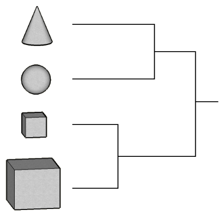 |
| Cluster tree |
Note that this single tree contains information about all
possible numbers of clusters.
Here we shall illustrate an application of hierarchical clustering using
the data set shapely.dat.
shap = read.table("shapley.dat",head=T)
dim(shap)
names(shap)
In this file we have some missing values for the variable
Mag
in column 3 that are coded as 0 (instead of NA). Let us
convert these to NA
shap[shap[,3]==0,3] = NA
plot(shap,pch=".")
Now we shall perform hierarchical clustering, but we shall use
only a subset of the data. We shall take only those cases where
V is between 12000 and 16000. Also we shall consider
only the three variables RA, DE and
V.
attach(shap)
shap = shap[V>12000 & V<16000,c("RA","DE","V")]
Next we shall centre and scale each variable (i.e., we
shall subtract the mean and divide by the standard
deviation). This is conveniently done by the scale
function.
shap = scale(shap)
In order to perform hierarchical clustering using the
hclust function we have to find the distance matrix of
the data. The (i,j)-th entry of this matrix gives the
Euclidean distance between the i-th and the j-th
point in the data set.
d = dist(shap)
mytree = hclust(d) #this may take some time
plot(mytree)
As we have mentioned earlier this hairy tree-like object (called
a dendrogram) represents clustering allowing all
possible numbers of clusters. In order to use it we have to
``cut'' it at a particular height as shown in the diagram below.
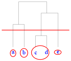 |
| Cutting a dendrogram |
Suppose that we want 3 clusters for the Shapley data set. The
dendrogram shows that we need to cut near height 6.
classes = cutree(mytree,h=6)
table(classes) #How many points in each class
Since we are working with 3D data (we have only 3 columns) so we
can make a 3D scatterplot.
scatterplot3d(shap,color=classes)
k-nearest neighbours classification
This method is motivated by how a child is taught to read. The
teacher first shows her some letters and tells her the names of
the letters, so that she can associate the names with the shapes.
 |
| The teacher's voice is shown in red |
Then she is presented with some letters to see if she can
identify them.
 |
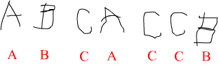
| The child is to identify these |
When she sees a new letter the child quickly matches the new
shape with ones he has learned, and says the name of the
letter that comes closest to the new letter.
Let us take a note of the different parts of this process. First,
we have a training data set: the letter shapes and their
names (shown in the first picture). Then we have a test data set
which is very much like the training set, except that the
names are not given.
We shall employ the same method to recognise the Hyades stars! We
shall start with a training data set consisting of 120 stars of
which the first 60 will be Hyades and the others not Hyades. We
are supposed to learn to recognise a Hyades star based on these.
Then we shall be given a test data set consisting of 56 new
stars, some of which are Hyades (we are not told which). Our
job will be to identify the Hyades stars in the test data sets.
First download (right-click and save to your computer) the two data sets:
train.dat and tst.dat.
Next, load them into R.
trn = read.table("train.dat",head=T)
tst = read.table("tst.dat",head=T)
dim(trn)
dim(tst)
We are told that the first 60 stars in the training data set are
Hyades, while the remaining 60 are not. So accordingly
we shall make a vector
of size 120:
trueClass = c(rep("Hyad",60),rep("NonHyad",60))
trueClass
Now it is time to apply the k-nearest neighbours
algorithm.
library("class")
foundClass = knn(trn,tst,trueClass,k=3)
Remember that tst consists of 56 stars, so
foundClass is a vector of that length.
foundClass
Here it so happens that there is not a single mistake!
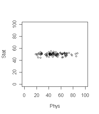
Principal Component Analysis
Consider 100 students with Physics and Statistics marks shown in
the diagram below.
If we want to compare among the students which grade should be a
better discriminating factor? Physics or Statistics? Surely
Physics, since the variation is larger there. This is a common
situation in data analysis where the direction along which the data
varies the most is of special importance.
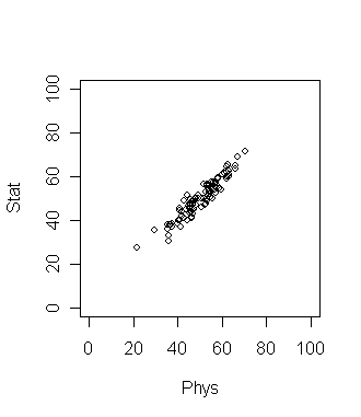
Now suppose that the plot looks like the following. What is the
best way to compare the students now?
Here the direction of maximum variation is like a slanted straight
line. This means we should take linear combination of the two
grades to get the best result. In this simple data set the
direction of maximum variation is more or less clear. But for
many data sets (especially high dimensional ones) such
visual inspection is not adequate or even possible! So we need
an objective method to find such a direction. Principal
Component Analysis (PCA) is one way to do this.
dat = read.table("marks.dat",head=T)
dim(dat)
names(dat)
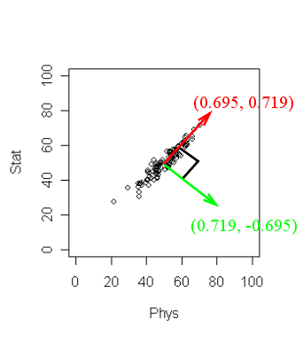
pc = princomp(~Stat+Phys,dat)
pc$loading
The output may not be readily obvious. The next diagram will
help.
R has returned two principal components. (Two because we
have two variables). These are a unit vector at right angles to
each other. You may think of PCA choosing a new coordinate system
for the data, the principal components being the unit vectors
along the axes. The first principal component gives the direction
of the maximum spread of the data. The second gives the direction
of maximum spread perpendicular to the first direction. But there
is yet more information. Type
pc
to learn the amount of spread of the data along the chosen
directions. Here the spread along the first direction is 12.40.
while that along the second is much smaller 1.98. These numbers
are often not of main importance, it is their relative magnitude
that matters.
Higher dimensions
Most statisticians consider PCA a tool for reducing dimension of
data. To see this consider the interactive 3D scatterplot below.
It is possible to rotate this plot with the mouse. By rotating
suitably we can see that the cloud of points is basically
confined in a 2D plane. In other words, the data set is
essentially 2D.
|
| Drag the picture with the mouse
|
The same conclusion may be obtained by PCA. Here the first two
components will be along the plane, while the third will be
perpendicular to the plane. These are shown as the three lines.
Now that we have seen how PCA can identify if the data cloud
resides in a lower dimensional space, we are ready to apply our
knowledge to astronomy. We shall work with the SDSS Quasar data
set stored in the file quasar.dat.
First we prepare the data set for analysis.
quas = read.table("SDSS_quasar.dat",head=T)
dim(quas)
names(quas)
quas = na.omit(quas)
dim(quas)
Now we shall apply PCA.
pc = princomp(quas[,-1],scores=T)
The scores=T option will automatically compute the
projections of the data along the principal component directions.
Before looking inside pc let us make a mental note
of what information we should be looking for. We should look for
the loadings (which are 22 mutually perpendicular unit vectors in
22-dimensional space). This means 22 times 22 = 484 numbers!
Whew! Then we should know the spread of the data cloud along each
of the 22 directions. That is just 22 numbers (lot less than
484). So we shall start by looking for these 22 numbers
first. Type
pc
to see them. Well, some of these are much larger than the
rest. To get an idea of the relative magnitudes, let us plot
them.
plot(pc)
So only the first 2 components account for the bulk. In other
words, the 22-dimensional data cloud essentially resides in just
a 2D plane! Which is that plane? The answer lies in the first two
columns of pc$loadings.
pc$loading[,1:2]
These give two mutually perpendicular unit vectors defining the
plane. To make sure that this is indeed the case you may check as
M = pc$loading[,1:2]
t(M) %*% M #should ideally produce the 2 by 2 identity matrix
You might like to project the entire data set onto this
plane.
plot(pc$scor[,1],pc$scor[,2],pch=".")
This is how the data cloud looks like in that magic plane in
22-dimensional space. And with my limited astronomy knowledge I
have no idea why these look like this!!!