Nonparametric statistics
This is the practical lab tutorial for nonparametric
statistics. But we shall start with a little theory that will be
crucial for understanding the underlying concepts.
Distributions
In statistics we often come across questions like
``Is a given data from such-n-such distribution?''
Before we can answer this question we need to know what is meant
by a distribution. We shall talk about this first.
In statistics, we work with random
variables. Chance controls their values.
The distribution of a random variable is the rule by which
chance governs the values.
If you know the distribution then you know the
chance of this random variable taking value in any given range.
This rule may be expressed in various ways. One popular way is
via the Cumulative Distribution Function (CDF), that we
illustrate now. If a random variable (X) has distribution with CDF
F(x) then for any given number a the chance that
X will be ≤ a is F(a).
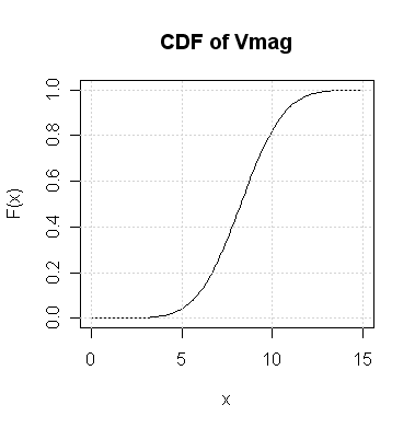
| Example:
Suppose that I choose a random star from the Hipparcos data
set. If I tell you that its Vmag is a random variable
with the following CDF then what is the chance that it takes values
≤ 10? Also find out the value x such that
the chance of Vmag being ≤ x is 0.4.
For the first question the required probability is F(10)
which, according to the
graph, is slightly above 0.8.
In the second part we need F(x) = 0.4. From the graph it
seems to be about 7.5.
Just to make sure that these are indeed meaningful, let us load
the Hipparcos data set and check:
hip = read.table("HIP.dat",head=T)
attach(hip)
n = length(Vmag) #total number of cases
count = sum(Vmag<=10) #how many <= 10
count/n #should be slightly above 0.8
This checks the answer of the first problem. For the second
count = sum(Vmag<=7.5) #how many <= 7.5
count/n #should be around 0.4
|
So you see how powerful a CDF is: in a sense it stores as much
information as the entire Vmag data. It is a
common practice in statistics to regard the distribution as the
ultimate truth behind the data. We want to infer about the
underlying distribution based on the data.
R has many standard distributions already built into it. This
basically means that R has functions to compute their CDFs.
These functions all start with the letter p.
| Example:
A random variable has standard Gaussian distribution. We know
that R computes its CDF using the function pnorm. How to
find the probability that the random variable takes values
≤ 1?
The answer may be found as follows:
pnorm(1)
|
For every p-function there is a
q-function that is basically its inverse.
| Example:
A random variable has standard Gaussian distribution. Find
x such that the random variable is ≤ x with
chance 0.3.
Now we shall use the function qnorm:
qnorm(0.3)
|
OK, now that we are through our litttle theory session, we are
ready for the nonparametric lab.
One sample nonparametric tests
Sign-test
In a sense this is the simplest possible of all tests. Here
we shall consider the data set LMC.dat that stores the measured
distances to the Large Magellanic Cloud.
LMC = read.table("LMC.dat",head=T)
data = LMC[,2] #These are the measurments
data
We want to test if the
measurements exceed 18.41 on an average. Now, this does
not
mean whether the average of the data exceeds 18.41, which is trivial
to find out. The question here is actually about the underlying
distribution. We want to know if the median of the underlying
distribution exceeds 18.41, which is a less trivial question,
since we are not given that distribution.
We shall use the sign test to see if the median is 18.41 or larger.
First it finds how many of the
observations are above this value:
abv = sum(data>18.41)
abv
Clearly, if this number is large, then we should think that the
median (of the underlying distribution) exceeds 18.41. The
question is how large is ``large
enough''? For this we consult the binomial distribution to get
the p-value. The rationale behind this should come from
the theory class.
n = nrow(LMC)
pValue = 1-pbinom(abv-1,n,0.5)
pValue
We shall learn more about p-values in a later
tutorial. For now, we shall use the following rule of thumb:
If this p-value is below 0.05, say, we shall conclude that
the median is indeed larger than 18.41.
Wilcoxon's Signed Rank Test
As you should already know from the theoretical class, there is a
test called Wilcoxon's Signed Rank test that is better (if a little
more complicated) than the sign test. R provides the function
wilcox.test for this purpose. We shall work with the
Hipparcos data set this time, which we have already loaded.
We want to see if the median of the distribution of the
pmRA variable is 0 or not.
wilcox.test(pmRA, mu=0)
Since the p-value is pretty large (above 0.05, say) we
shal conclude that the median is indeed equal to 0. R itself
has come to the same conclusion.
Incidentally, there is a little caveat. For Wilcoxon's Rank Sum Test
to be applicable we need the underlying distribution to be
symmetric around the median. To get an idea about this we should
draw the histogram.
hist(pmRA)
Well, it looks pretty symmetric (around a centre line).
But would you apply Wilcoxon's
Rank Sum Test to the variable DE?
hist(DE)
No, this is not at all symmetric!
Kernel density estimation
We have already mentioned how important the distribution
underlying a sample is, and how the distribution may be specified
via its CDF. An (almost) equivalent way of specifying the
distribution is via its density function, which is just
the derivative of the CDF. The simplest way to get an idea about
the density function underlying a data set is to make its
histogram. The diagram below shows a density and the typical shape
of the histogram that you can expect for a data set with this
density. Note the similarity in shape.
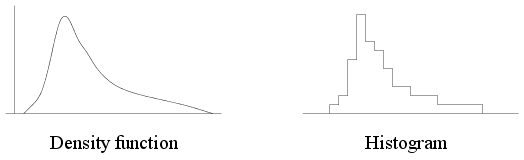 |
| A density function and a typical histogram |
Here is how we can use histograms to estimate the density of
Vmag.
hist(Vmag, prob=T)
Typically densities are smooth functions, while histograms are
jagged. A better estimate may be obtained using kernels as
we have seen in the theory class.
Let us start with a very simple example to get the procedure
right. We shall apply the
Gaussian kernel to a sample consisting of just two points!
source("krnl1.r")
We shall take some time to understand the different parts of the
plot that pops up. Recall that the kernel density estimator has
the formula
where K is the kernel used. In our example, the sum has
just two terms
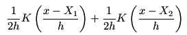
that are half the Gaussian densities centred around the two points.
These are shown in red. The sum (which is the kernel density
estimate) is shown in black.
Now notice the little pop up window that looks something like
this:
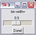 |
| Kernel pop up |
Move the slider to change the bin width (which controls how
peaked the kernel is). See how a large value of the bin width
produces a flat estimator, while a small value produces two peaks
(one for each point). You may not readily notice that the black
curve is getting flatter with increasing bin width, until you
notice how the x-axis is growing and the y-axis
shrinking.
Next we shall move over to a more realistic situation where we
shall work with 100 observations that are artificially generated
from the standard Gaussian distribution. The aim now will be to
compare the estimated density with the actual density (which we
know since the data set is artificial).
source("krnl2.r")
Again play with the slider and convince yourself that small bin
widths produce jagged estimated, while large ones produce flat
estimates. The best value is somewhere in the middle. The
theoretical class has taught you how to find a good bin
width. You can also let R find a good value for you as we shall
see next. We shall use the Hipparcos data set once again and the
function density.
dd = density(Vmag)
plot(dd$x,dd$y,ty="l")
It might be more interesting to see the estimate overlayed on top
of the histogram:
hist(Vmag,prob=T)
lines(dd$x,dd$y,col="red")
What bin width did R use? To see this look inside
dd:
dd
If you would like to try a different bin width (say 0.1) then
that is OK
too:
dd2 = density(Vmag,bw = 0.1)
lines(dd2$x,dd2$y,col="blue")
| Exercise:
All these examples work with the Gaussian kernel. R allows you to
use a number of other kernels as well: Epanechnikov, Rectangular,
and Triangular, among others.
Try these out to see that the choice of the kernels does not
matter as much as the bin width does. Here is how you specify the
kernel:
dd3 = density(Vmag,kernel="epan") #abbrevs are OK
lines(dd3$x,dd3$y,col="green")
|
Q-Q plot
Suppose that you are given a random sample and asked to check if
it comes from the standard Gaussian distribution. There are many
ways to go about it, and the Q-Q plot is one of the easiest.
To understand this process let us use a small data set:
x = c(2.3, -0.3, 0.4, 2.0, -1.1, 1.0, 2.1, 3.4, -0.4, 0.5, 1.2,
      2.1)
n = length(x)
n
First we shall sort them in increasing order:
sortedX = sort(x)
sortedX
Now pick a number in this sorted list. Say we pick the 3rd
number, which is -0.3.
What is the fraction of numbers that are less than or equal to this?
Clearly, it is
3/n = 3/12 = 0.25.
frac = 3/n
So we see that 0.25 fraction of the
numbers are less than or equal to -0.3 in the data.
Now it is time to compare it with what we should see for a true
standard Gaussian data. We shall find
the number M such that the a standard Gaussian random
variable will be ≤ M with chance 0.25. Then ideally
M should be close to our observed -0.3.
M = qnorm(frac)
Well, due to a little technicality we subtract 1/2n from
0.25. This hardly matters when n is large.
M = qnorm(frac -  1/(2*n) )
M
This M is far from -0.3, and so we become suspicious that
our sample is not from the standard Gaussian distribution.
So far we are working with just the 3rd number in
sortedX, which we picked
arbitrarily. We now repeat the process for all the points.
frac = (1:n)/n
M = qnorm(frac - 1/(2*n))
plot(M,sortedX)
This is called the Q-Q plot of the sample against the
standard Gaussian distribution. If the points are close to the
y=x line then we can be hopeful that the sample is indeed
from a standard Gaussian distribution. To facilitate the
comparision let us add the y=x line to the plot.
abline(a=0,b=1)
Well, our data is far from standard Gaussian!
Comparison with the Gaussian distribution is so very common that
R provides a function qqnorm for it.
qqnorm(x)
R does not provide any readymade function for making a Q-Q plot
against other distributions. But one can always follow the method
shown here to make a Q-Q plot against any distribution for which
R can compute the CDF (or, rather, its inverse using a
q-function).
Kolmogorov-Smirnov test
The theory class has talked about a non-parametric test called
Kolmogorov-Smirnov test. We shall cover it in a later tutorial.
k-nearest neighbours
Imagine that you are given a data set of average parent heights
and their adult sons' heights, like this (ignore the colour for
the time being):
Parent  Son
5.5     5.9
5.4     5.3
5.7     5.9
5.1     5.3
6.0     5.8
5.5     5.2
6.1     6.0
A prosepective
couple comes to you, reports that their average height is 5.3
feet, and wants you to predict (based on this data set) the
height their son would attain
at adulthood. How should you proceed?
A pretty simple method is this: look at the cases in your data
set with average parents' height near 5.3. Say, we consider the 3
nearest cases. These are shown in red in the above data
set. Well, there are 4 cases, and not 3. This is because there
is a tie (three cases 5.1, 5.5, 5.5 that are at same
distance from 5.3).
Now just report the average of the sons' height for these cases.
Well, that is all there is to it in 3-NN regression (NN = Nearest
Neightbour)! Let us
implement this in R. First the data set
parent = c(5.5, 5.4, 5.7, 5.1, 6.0, 5.5, 6.1)
son = c(5.9, 5.3, 5.9, 5.3, 5.8, 5.2, 6.0)
Now the new case:
newParent = 5.3
Find the ditances of the parents' heights from this new height:
d = abs(parent- newParent)
Rank these:
rnk = rank(d,tie="min")
rnk
Notice the tie="min" option. This allows
the three joint seconds to be each given rank 2.
We are not using order here (as it does not handle ties
gracefully). Now identify the 3 nearest cases (or more in case of
ties).
nn = (rnk<=3)
nn
Now it is just a matter of taking averages.
newSon = mean(son[nn])
newSon
It is instructive to write a function that performs the above
computation.
knnRegr = function(x,y,newX,k) {
  d = abs(x-newX)
  rnk = rank(d,tie="min")
  mean(y[rnk<=k])
}
Now we can use it like
newSon = knnRegr(parent,son,newParent,3)
| Exercise:
You shall apply the function that we have just written to the
Hipparcos data set.
plot(RA,pmRA)
We want to explore the relation between RA and
pmRA using the k-nearest neighbour
method.
Our aim is to predict the value pmRA based on a
new value of RA:
newRA = 90.
Use the knnRegr function to do this with k=13.
|
Nadaraya-Watson regression
While the k-nearest neighbour method is simple and
reasonable it is nevertheless open to one objection that we illustrate
now. Suppose that we show the x-values along a number line
using crosses as below. The new x-value is shown
with an arrow. The 3 nearest neighbours are circled.
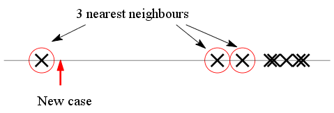 |
| Are the 3 NN equally relevant? |
The k-NN method now requires us to simply average the
y-values of the circled cases. But since two of the points
are rather far away from the arrow, shouldn't a weighted
average be a better method, where remote points get low
weights?
This is precisely the idea behind the Nadaraya-Watson
regression. Here we average over all the cases (not just
nearest neighbours) but cases farther away get less weight. The
weights are decided by a kernel function (typically a
function peaked at zero, and tapering off symmetrically on both
sides).
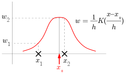 |
| How the kernel determines the weights |
Now we may simply take the weighted average. We shall apply it to
our parent-son example first.
parent = c(5.5, 5.4, 5.7, 5.1, 6.0, 5.5, 6.1)
son = c(5.9, 5.3, 5.9, 5.3, 5.8, 5.2, 6.0)
newParent = 5.3
kernel = dnorm #this is the N(0,1) density
Now let us find the weights (for a bin width (h) = 0.5, say):
h = 0.5
wt = kernel((parent- newParent)/h)/h
Finally the weighted average:
newSon = weighted.mean(son,w = wt)
| Exercise:
Write a function called, say, nw, like this
nw = function(x,y,newX,kernel,h) {
  #write commands here
}
[Hint: Basically collect the lines that we used just now.]
Now use it to predict the value of pmRA when
RA is 90 (use h=0.2):
newRA = 90
newpmRA = nw(RA,pmRA,newRA,dnorm,0.2)
|
Two-sample nonparametric tests
Here we shall be taking about the shape of distributions. Let us
first make sure of this concept. Suppose that I make a list of
all the people in a capitalist country
and make a histogram of their incomes.
I should get a histogram like this
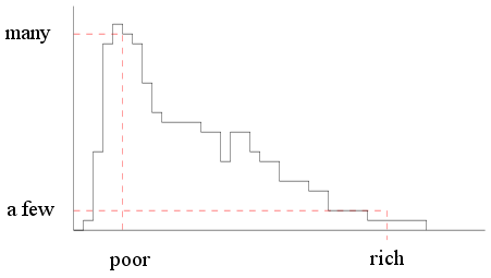 |
| Income histogram of a capitalist
country |
But if the same thing is done for a socialist country we shall
see something like this (where almost everybody is in the middle
income group).
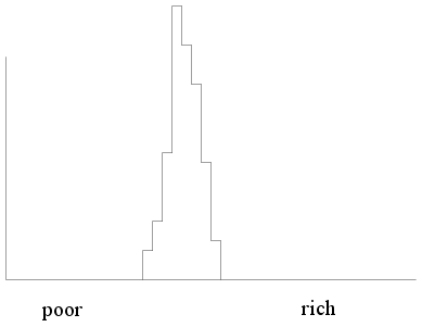 |
| Income histogram of a socialist
country |
Clearly, the shapes of the histograms differ for the two
populations. We must be careful about the term ``shape'' here. For
example, the following two histograms are for two capitalist
countries, one rich the other poor.
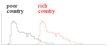 |
| Income histograms two capitalist
countries |
Here the histograms have the same shape but differ in
location. You can get one from the other by applying a
shift in the location.
This is a very common phenomon in statistics. If we have two
populations with comparable structure they often have similar
shapes, and differ in just a location shift. In such a situation
we are interested in knowing about the amount of shift. if the
amount of shift is zero, then the two populations behave
identically.
Wilcoxon's rank sum test is one method to learn about the amount
of shift based on samples from the two populations.
We shall start with the example done in the theory class, where
we had two samples
x = c(37,49,55,57)
y = c(23,31,46)
m = length(x)
n = length(y)
We are told that both the samples come from populations with the
same shape, though one may be a shifted version of the
other.
Our aim is to check if indeed there is any shift or not.
We shall consider the pooled data (i.e., all the 7 numbers
taken together) and rank them
pool = c(x,y)
pool
r = rank(pool)
r
The first m=4 of these ranks are for the first
sample. Let us
sum them:
H = sum(r[1:m])
H
If the the two distributions are really identical (i.e.,
if there is no shift) then we should have (according to the
theory class) H close to the value
m*(m+n+1)/2 #Remember: * means multiplication
Can the H that we computed from our data be considered
``close enough" to this value? We shall let us R determine that
for us.
wilcox.test(x,y)
So R clearly tells us that there is a shift in location. The
output also mentions a W and a
p-value.
tutorial. But W is essentially what we had called
H. Well, H was 21, while W is 11. This
is because R has the habit of subtracting
m(m+1)/2
from H and calling it W. Indeed for our data set
m(m+1)/2 = 10,
which perfectly accounts for the difference between our H
and R's W.
You may recall from the theory class that H is called
Wilcoxon's rank sum statistic, while W is the Mann-Whitney
statistic (denoted by U in class).
Now that R has told us that there is a shift, we should demand to
estimate the amount of shift.
wilcox.test(x,y,conf.int=T)
The output gives two different forms of estimates. It
gives a single value (a point estimate) which is 16.
Before it gives a 95% confidence interval: -9 to
34.
This
basically means that
we can say with 95% confidence that
the true value of the shift is between -9 and 34.
We shall talk more about confidence intervals later. For now let
us see how R got the poit estimate 16. It used the so-called
Hodges-Lehman formula, that we have seen in the theoretical
class. To see how this method works we shall first form the following
"differecne table"
  | 23 31 46
------------
37| 14  6 -9
49| 26 18  3
55| 32 24  9
57| 34 26 11
Here the rows are headed by the first sample, and coumns by the
second sa,mple. Each entry is obtained by subtracting the column
heading from
the row heading (e.g., -9 = 37-46). This table, by the
way, can be created very easily with the function outer.
outer(x,y,"-")
 |
 |  |  |
|
The outer function is a very useful (and somewhat
tricky!) tool in R. It takes two vectors x, and y,
say, and some function f(x,y). Then it computes a matrix
where the (i,j)-th entry is
f(x[i],y[j]).
| |
 | |  |
|
Now we take the median of all the entries in the table:
median(outer(x,y,"-"))
This gives us the Hodges-Lehman estimate of the location shift.