Regression and Time Series
Regression
In every walk of science we come across
variables related among to one another. Mathematical formulations
of such relations occupy an
important place in scientific research. When only two variables
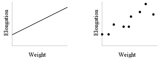
are involved we often plot a curve to show functional
relationships as in the left hand figure below which depicts the
relation between the length of a steel wire and the weight
suspended from it.
However, what the experimenter sees in the laboratory is not this
neat line. He sees a bunch of points as shown in the right hand
figure. One idealises these points to get the straight line.
This process of extracting an ideal (and, desirably, simple)
relation between variables based on observed data is called
regression analysis.
Often the relationship between two variables has a causal
flavour. For example, in our example, we like to think of the
weight as causing the elongation. Thus, weight is the
variable that is under direct control of the experimenter. So we
call it the explanatory variable. The other variable
(elongation) is called the response. If we have a single
explanatory variable and a single response (as here), then we
have a bivariate regression problem. A multivariate
regression problem has more than one explanatory variable, but
(usually) a single response. We shall talk about bivariate
regression first.
Bivariate regression
A typical regression analysis proceeds in four steps:
- First we postulate a form of the relation, like a
straight line or a parabola or an exponential curve. The form
involves unknown numbers to be determined. For instance, a straight line
has equation y = a + bx, where a,b are unknown
numbers to
be determined. Typically the form of the relation is obtained by
theoretical considerations and/or looking at the scatterplot.
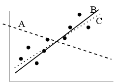
- Next we have to decide upon an objective criterion of
goodness of fit. For instance, in the plot below, we can see that
line A is a bad fit. But both B and C appear
equally good to the naked eye. An objective criterion for
goodness of fit is needed to choose one over the other.
- Once we have chosen the form as well as the criterion, it is
a matter of routine computation to
find a relation of our chosen form that fits the data best.
Statistics textbooks spend many pages elaborating on this
step. However, for us it is just a matter of invoking R.
- Last but not the least, we have to check whether the ``best''
relation is indeed what we expected. (Common sense above routine
computation!)
Let us load the Hipparcos data set and extract the Hyades
stars. We shall do this by just invoking the script that we had
created earlier.
source("hyad.r")
attach(hip[HyadesFilter,])
We shall now define a luminosity variable logL
logL = (15 - Vmag - 5 * log10(Plx)) / 2.5
Let us make a scatterplot of this variable against
B.V
plot(B.V,logL)
Well, the plot seems to indicate a relation of the form
logL = a + b B.V
So we have finished the first step.
Next we have to decide upon an
objective criterion for goodness of fit. We shall use the most
popular choice: least squares.
To understand the meaning of this consider the following graph
that shows a line drawn over the scatterplot.
 |
| The concept of Least Squares |
From each of the data points we have drawn a vertical to the
line. The length of these verticals measure how much the actual
value of logL differs from that predicted by the
line. In Least Squares method we try to choose a line that
minimises the sum of squares of these errors.
In the third step you will invoke the
lm function of R to find the best values of a and
b as follows.
bestfit = lm(logL ~ B.V)
Notice the somewhat weird notation logL ~ B.V. This
means the formula
logL = a + b B.V
In fact, if we write y ~ x1+x2+...xk then R
interprets this as
y = a0 + a1 x1 +
... + ak xk,
where a0,...,ak are the
parameters to be determined.
plot(B.V,logL)
abline(bestfit)
bestfit
This finishes the third step. The final step is to check how good
the fit is. Remember that a fundamental aim of regression is to
be able to predict the value of the response for a given value of
the explanatory variable. So we must make sure that we are able
to make good predictions and that we cannot improve it any
further.
The very first thing to do is to plot the data and overlay the
fitted line on it, as we have already done. The points should be
close to the line without any pattern. The lack of pattern
is important, because if there is some pattern then we can
possibly improve the fit by taking this into account. In our
example there is a pattern: the points in the middle are
mostly below the line, while the points near the extremes are
above. This suggests a slight curvature. So we may be
better off with a quadratic fit.
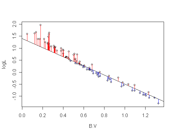
The second thing to do is to plot the residuals. These are
the the actual value of the response
variables minus the fitted value. In terms of the least squares
plot shown earlier these are the lengths of the vertical lines
representing errors. For points above the line (red verticals)
the sign is negative, while for the blue verticals the sign is
positive.
The residuals are computed by
the lm function
automatically.
res = bestfit$resid
plot(res)
abline(h=0)
Ideally the points should all be scattered equally around the
zero line. But here the points below the line look more densely
spaced.
Next we should plot the residuals against the explanatory
variable.
plot(B.V,res)
abline(h=0)
The clear U pattern is a most decisive demonstration that our
best fit can possibly be improved further if we fit a parabola
instead of a straight line.
Now that we are a bit wiser after our first attempt at regression
analysis of the Hyades data set we should go back to step 1 and
choose the parabolic form
logL = a + b B.V + c
B.V2.
This form has three unknown parameters to be determined:
a,b and c. Again we come to step 2. We shall still
choose the least squares method. The third step is almost as
before
bestfit2 = lm(logL ~ B.V + I(B.V^2))
The only unexpected piece in the above line is the
I. This admittedly awkward symbol means the
B.V^2 should be treated as is. (What happens
without this I is somewhat strange and its explanation
is beyond the present scope.)
bestfit2
summary(bestfit2)
Now let us look at the fitted line. However, unlike the straight
line case, here we do not have any ready-made function like
abline. We shall need to draw the curve directly using
the fitted values. Here is the first attempt:
plot(B.V,logL)
lines(B.V,bestfit2$fit)
Oops! We did not want this mess! Actually, what the
lines function does is this: it plots all supplied the
points and joins them in that order. Since the values of
B.V are not sorted from small to large, the lines
get drawn haphazardly. To cure the problem we need to sort
B.V and order the fitted values accordingly.
This is pretty easy in R:
ord = order(B.V)
plot(B.V,logL)
lines(B.V[ord],bestfit2$fit[ord])
This line does seem to be a better fit than the straight line
that we fitted earlier. Let us make the residual plot. But this
time we shall use a built-in feature of R.
plot(bestfit2,3)
In fact, R can automatically make 4 different plots to assess the
performance of the fit. The 3 in the command asks R to produce
the 3rd of these. The others are somewhat more advanced in
nature. There are three points to note here.
- the vertical axis shows the square root of something called
standardised residual. These are obtained by massaging the
residuals that we were working with. The extra massaging
makes the residuals more ``comparable''
(somewhat like making the denominators equal before comparing two
fractions!)
- the horizontal axis shows the fitted values.
- the wavy red line tries to draw our attention to the general
pattern of the points. Ideally it should be a horizontal line.
- There are three points that are rather too far from the zero
line. These are potential trouble-makers (outliers) and R has
labelled them with their case numbers.
To see the values for the point
labelled 54 you
may use
B.V[54]
logL[54]
Typically it is a good idea to take a careful look at these values to
make sure there is nothing wrong with them (typos etc). Also,
these stars may indeed be special. Some one analysing the data about
the ozonosphere had stumbled across such outliers that turned
out to be the holes in the ozone layer!
Comparing models
Sometimes we have two competing fits for the same
data. For example, we had the straight line as well as the
quadratic line. How do we compare between them? ``Choose the one
that goes closer through the points" might look like a tempting
answer. But unfortunately there is a snag. While we want the fit
to pass close to the points, we also want to keep the equation of
the fit as simple as possible! (This is not merely out of an
ascetic love for simplicity, there are also deep statistical
implications that we cannot discuss here.) Typically, these two
criteria: simplicity and proximity to all the
points act in opposite directions. You gain one only by
sacrificing the other. There are criteria that seek to strike a
balance between the twain. We shall discuss two of them here:
Akaike's Information Criterion (AIC) and Bayesian Information
Criterion (BIC), both being computed using a function called
AIC in R:
AIC(bestfit1)
AIC(bestfit2)
The smaller the AIC the better is the fit. So here the quadratic
fit is indeed better. However, AIC is known to overfit:
it has a bias to favour more complicated models. The BIC
seeks to correct this bias:
n = length(B.V)
AIC(bestfit1,k=log(n)) #This computes BIC
AIC(bestfit2,k=log(n))
Well, BIC also confirms the superiority of the
quadratic. Incidentally, both the AIC and the BIC are merely
dumb mathematical formulae.
 |
 |  |  |
|
It is always important to use domain
knowledge and common
sense to check the fit.
| |
 | |  |
|
In particular, here one must remove those
three outliers and redo the computation just to see if there is a
better fit.
Robustness
Outliers are a constant source of headache for the statistician,
and astronomical data sets are well known for a high content of
outliers (after all, the celestial bodies are under no obligation
to follow petty statistical models!) In fact, detecting outliers
is sometimes the most fruitful outcome of an analysis. In order
to detect them we need statistical procedures that are dominated
by the general trend of the data (so that the outliers show up in
contrast!) A statistical process that is dominated only by the
majority of the points (and not by the outliers) is called
robust. The second step in a regression analysis (where we
choose the criterion) determines how robust our analysis will
be. The least squares criterion that we have used so far is not
at all robust.
We shall now compare this with a more robust
choice that is implemented in the function lqs of the
MASS package in R.
|
| | |
|
A package in R is like an add-on.
It is a set of functions and data sets (plus online helps on these)
that may reside in your machine but are not automatically loaded into
R. You have to load them with the function library like
library(MASS) #MASS is the name of the package
The package mechanism is the main way R grows as more and more
people all over the world write and contribute packages to R.
It is possible to make R download and install necessary packages
from the
internet, as we shall see later.
| |
| | |
|
To keep the exposition simple we shall again
fit a straight line.
library(MASS)
fit = lm(logL ~ B.V)
robfit = lqs(logL ~ B.V)
plot(B.V,logL)
abline(fit,col="red")
abline(robfit,col="blue")
Well, the lines are different. But just by looking at this plot
there is not much to choose the robust (blue) one over the least
square (red). Indeed, the least squares line seems a slightly
better fit. In order to appreciate the benefit of robustness we
have to run the following script. Here you will again start with
the same two lines, but now you can add one new point to
the plot by clicking with your mouse. The plot will automatically
update the two lines.
source("robust.r")
You'll see that a single extra point (the
outlier) causes the least squares (red)
line swing more that the robust (blue) line. In fact, the blue
line does not seem to move at all!
Right click on the plot and select "Stop" from the pop-up menu to
come out.
Parametric vs. nonparametric
Here we shall take consider the first step (choice of the form)
once more. The choice of the form, as we have already pointed
out, depends on the underlying theory and the general pattern of
the points. There may be situations, however, where it is
difficult to come up with a simple form. Then it is common to use
non-parametric regression which internally uses a
complicated form with tremendous flexibility. We shall
demonstrate the use of one such method called LOWESS which is
implemented as the function lowess in R.
plot(B.V,logL)
fit = lowess(logL~B.V)
lines(fit)
A newer variant called loess produces very similar
result. However, drawing the line is slightly more messy here.
fit2 = loess(logL~B.V)
ord = order(B.V)
lines(B.V[ord],fit2$fitted[ord],col="red")
Multiple regression
So far we have been working with bivariate regression, where we
have one response and one explanatory variable. In multiple
regression we work with a single response and at least two
explanatory variables. The same functions (lm,
lqs, loess etc) handle multiple regression in
R. We shall not discuss much of multiple regression owing to its
fundamental similarity with the bivariate case. We shall just
show a single example introducing RA
and DE as explanatory variables as well as
B.V.
fit = lm(logL~B.V+RA+DE)
summary(fit)
We shall not go any deeper beyond pointing out that the absence
of the asterisks in the RA and DE lines
mean these extra explanatory variables are useless
here.
A word of wisdom
Our exposition so far has been strictly from the users'
perspective with the focus being on commands to achieve things,
and not how these commands are internally executed. Sometimes the
same problem can be presented in different ways that are all
essentially the same to the user, but quite different for the
underlying mathematics. One such example is that R prefers the
explanatory variables to be centred, that is, spread
symmetrically around 0. This enhances the stability of the
formulae used. So instead of
lm(logL ~ B.V)
we should do
B.V1 = B.V - mean(B.V)
lm(logL ~ B.V1)
|
| | |
| Always centre the explanatory variables
before performing regression analysis. This does not apply to the
response variable.
| |
| | |
|
Time series analysis
Many data sets are collected over a period of time, and the
temporal evolution of the figures is often of fundamental
interest. Such a data set is called a time series and
analysis of time series data forms a major branch of statistics.
As an example we shall consider a part of the Wolfer sunspot data
set which gives the monthly averages numbers of sunspots from
1749 to 1983. This data set is already part of R, but we shall
load it from outside in order to explain some points.
dat = read.table("sspot.dat",head=T)
names(dat)
attach(dat)
sspot
length(sspot)
Next we shall plot the time series
plot(sspot,ty="l")
Notice how the time axis is labelled with indices instead of
time. We would prefer to see that axis labelled with years.
For this we need to tell R that sspot vector is
actually monthly time series starting from Jan, 1749.
sspot = ts(sspot,freq=12,start=c(1749,1))
The ts function creates a time series object in R. The
freq=12 means every 12 observations form a time unit
(a year in our case). This establishes two units of measurements,
the main unit (year) consisting of 12 subunits (months). Each
observation is for a subunit.
The series starts at Jan, 1749. So the starting unit is 1749, and
starting subunit is 1.
Let us plot the time series again.
plot(sspot)
This looks like a more reasonable thing! One important aspect of
any time series is whether it contains any periodic pattern. The
regular ups and downs in the graph suggests such a pattern and we
want to determine the period using Fourier analysis, which
is basically like spectroscopy of the data.
sp = spectrum(sspot,plot=F)
names(sp)
We shall need the freq and spec fields
only.
plot(sp$freq,sp$spec,ty="l")
This is the graphical representation of the spectrum. The
horizontal axis gives the colour and the vertical axis gives the
brightness of the line. Indeed, if we interpret the frequency range
as the visible colours then the plot just obtained corresponds to the
following spectrum
 |
| A visual spectrum |
We can see that only a single frequency is present dominantly. We
shall find the period (i.e., the reciprocal of the
frequency) associated with it.
index = which.max(sp$spec)
1/sp$freq[index]
The answer is in the main unit of the time series (i.e.,
years in our example). So we conclude that the number of sunspots
repeat periodically approximately every 11 years.