Descriptive Statistics and Graphing with R
In this tutorial we shall learn to perform simple statistical
analysis and plotting of data with R. The parts involving
astronomical information are based on the notes by
Prof. David Hunter.
Getting astronomical data
The astronomical community has a vast complex of on-line
databases. Many databases are hosted by data centres such as the
Centre des
Donnees astronomiques de Strasbourg (CDS), the NASA/IPAC Extragalactic Database
(NED), and the Astrophysics
Data System (ADS).
The Virtual Observatory (VO) is developing new flexible tools for
accessing, mining and combining datasets at distributed
locations; see
the Web sites for the international,
European, and U.S. VO for information on recent
developments. The VO Web
Services, Summer
Schools, and Core Applications
provide helpful entries into these new capabilities.
We initially treat here only input of tabular data such as catalogs of
astronomical sources. We give two examples of interactive
acquisition
of tabular data. One of the multivariate tabular datasets used
here is
a dataset of stars observed with the European Space Agency's Hipparcos
satellite during the 1990s. It gives a table with 9 columns and
2719 rows giving Hipparcos stars lying between 40 and 50 parsecs from
the Sun. The dataset was acquired using CDS's Vizier Catalogue Service as
follows:
- In Web browser, go to
http://vizier.u-strasbg.fr/viz-bin/VizieR?-source=I/239/hip_main
-
Set Max Entries to 9999, Output layout ASCII table
- Remove
"Compute r" and "Compute Position" buttons
-
Set parallax constraint "20 .. 25" to gives stars between 40 and 50 pc
-
Retrieve 9 properties: HIP, Vmag, RA(ICRS), DE(ICRS), Plx, pmRA, pmDE, e_Plx, and B-V
- Submit
Query
- Use ASCII editor to trim header to one line with variable
names
- Trim trailer
- Indicate missing values by NA.
- Save ASCII file on disk for ingestion into R
Reading the data into R
Let us assume that the data set is in
F:\astro\HIP.dat
We have already learned how to use the absolute path
F:\astro\HIP.dat to load the data set into R. Now
we shall learn a two step process that is usually easier.
First navigate to the correct folder/directory
setwd("F:/astro") #notice the forward slash
getwd() #just to make sure
The function setwd means "set working
directory".
Now load the data set
hip = read.table("HIP.dat", header = TRUE, fill = TRUE)
 |
 |  |  |
|
The advantage of using setwd is that you have to type
the name of the folder/directory only once. All files
(data/script) in that folder can then be referred to by just the
their names.
| |
 | |  |
|
After the loading is complete we should make sure that things are
as they should be. So we check the size of the data set, the
variable names.
dim(hip)
names(hip)
Let us take a look at the first 3 rows of the data set.
hip[1:3,]
| Exercise:
What command should you use to see the first 2 columns?
|
There is a variable called RA in the data set. It corresponds to
column 3 in the data set. To see its values
you may use either
hip[,3]
or
hip[,"RA"]
Incidentally, the first column is just an index variable without
any statistical value. So let us get rid of it.
hip = hip[,-1]
Summarising data
The following diagram shows four different data sets along a
number line.
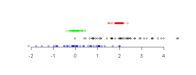 |
| Four data sets shown along a number line |
Notice that the points in the red data set (topmost) and the
black data set (third from top) are more or less around the same
centre point (approximately 2). The other two data sets are more
or less around the value 0. We say that the red and black data
sets have the same central tendency, while the other data
sets have a different central tendency.
Again, notice that the points in the red and blue data sets (the topmost two)
are tightly packed, while the other two data sets have larger
spreads. We say that the bottom two data sets have larger
dispersion than the top two.
Central tendency
When summarising a data set we are primarily interested in
learning about its central tendency and dispersion. The central
tendency may be obtained by either the mean or
median. The median is the most central value of a
variable.
To find these for all the variables in
our data set we apply the mean and
median function on the columns.
apply(hip,2,mean)
Have you noticed the mean of the last variable? It is
NA or ``Not Available'', which is hardly surprising since
not all the values for that variable were present in the original
data set. We shall learn later how to deal with missing
values (NAs).
| Exercise:
Find the median of all the variables.
|
Dispersion
Possibly the simplest (but not the best) way to get an idea of the
dispersion of a data set is to compute
the min and max. R has the functions min and
max for this purpose.
apply(hip,2,min)
apply(hip,2,max)
In fact, we could have applied the range function to
find both min and max in a single line.
apply(hip,2,range)
The most popular way to find the dispersion of a data set is by
using the variance (or its positive square root, the
standard deviation). The formula is
where  is the mean of the data. The function
var and sd compute the variance and standard
deviation.
var(hip[,"RA"])
sd(hip[,"RA"])
Another popular measure of dispersion is
the median
absolute deviation (or MAD) is proportional to the median
of the
absolute distances of the values from the median. It is given by
the following formula.

The constant of proportionality happens to be the magic number
1.4826 for some technical reason.
For example, if we have just 3 values 1,2 and 4, then
- the median is 2,
- absolute deviations from median are |1-2|=1, |2-2|=0 and
|4-2|=2,
- median of the absolute deviations is 1,
- MAD = 1.4826.
The function
mad computes this.
mad(c(1,2,4))
For example,
mad(hip[,1])
We want to compute both the median and MAD using one function. So
we write
f = function(x) c(median(x), mad(x))

f(hip[,1])
| Exercise:
What will be the result of the following?
apply(hip,2,f)
|
There is yet another way to measure the dispersion of a data
set. This requires the concept of a quantile. Some
examinations report the grade of a student in the form of
percentiles. A 90-percentile student is one whose
grade is exceeded by 10% of all the students. The quantile
is the same concept except that it talks about proportions instead
of percentages. Thus, the 90-th percentile is 0.90-th quantile.
| Exercise:
The median of a data set is the most central value. In other
words, exactly half of the data set exceeds the median. So for
what value of p is the median the p-th quantile?
|
The R function quantile (not surprisingly!) computes
quantiles.
quantile(hip[,1],0.10)
quantile(hip[,1],0.50)
median(hip[,1])
The 0.25-th and 0.75-th quantiles are called the first
quartile and the third quartile, respectively.
| Exercise:
What is the second quartile?
|
quantile(hip[,1],c(0.25,0.50,0.75))
The difference between first and third quartiles is another
measure of the dispersion of a data set, and is called the
InterQuartile Range (IQR).
There is function called summary that computes quite a
few of the summary statistics.
summary(hip)
| Exercise:
Look up the online help for the functions cov and
cor to find out what they do. Use them to find the
covariance and correlation between RA and
pmRA.
|
Handling missing values
So far we have ignored the NA problem completely. The next
exercise shows that this is not always possible in R.
| Exercise:
The function var computes the variance. Try
applying it to the columns of our data set.
|
NA denotes missing data in R. It is like a different kind of
number in R (just like Inf, or NaN). Any mathematics with NA
produces only NA
NA + 2
NA - NA
The function is.na checks for presence of NAs in a
vector or matrix.
x = c(1,2,NA)
is.na(x)
any(is.na(x))
The function any reports TRUE if there is at least one
TRUE in its argument vector. The any and is.na
combination is very useful. So let us make a function out of
them.
hasNA = function(x) any(is.na(x))
| Exercise:
What is the consequence of this?
apply(hip,2,hasNA)
|
This exercise shows that only the last variable has NAs
in it. So
naturally the following commands
min(B.V)
max(B.V)
mean(B.V)
all return NA. But often we want to apply the function on only
the non-NAs. If this is what we want to do all the time then we
can omit the NA from the data set it self in the first
place. This is done by the na.omit function
hip1 = na.omit(hip)
dim(hip)
dim(hip1)
This function takes a very drastic measure: it simply wipes out
all rows with at least one NA in it.
apply(hip,2,mean)
apply(hip1,2,mean)
Notice how the other means have also changed.
Of
course, you may want to change only the B.V
variable. Then you
need
B.V1 = na.omit(hip[,"B.V"])
| Exercise:
Compute the variances of all the columns of hip1
using apply.
|
There is another way to ignore the NAs without omitting them from
the original data set.
mean(hip[,"B.V"],na.rm=T)
var(hip[,"B.V"],na.rm=T)
Here na.rm is an argument that specifies whether
NAs should be removed. By setting it equal
to T (or TRUE) we are asking the function to
remove all the obnoxious NAs.
You can use this inside apply as well
apply(hip,2,var,na.rm=T)
Attaching a data set
A data set in R is basically a matrix where each column denotes a
variable. The hip data set, for example, has 8
variables (after removing the first column) whose names are obtained as
names(hip)
To access the RA variable we may use
hip[,"RA"] # too much to type
or
hip[,3] # requires remembering the column number
Fortunately, R allows a third mechanism to access the individual
variables in a data set that is often easier. Here you have to
first attach the data set
attach(hip)
This unpacks the data set and makes its columns accessible by
name. For example, you can now type
RA # instead of hip[,"RA"]
mean(RA)
hasNA(RA)
We can of course still write
hip[,"RA"]
Making plots
Graphical representations of data are a great way to get a
``feel'' about a data set, and R has a plethora of plotting
functions.
Boxplots
Consider the two data sets shown along a number line.
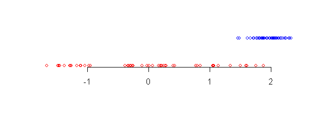 |
| Two data sets |
When we look at the data sets for the first time our eyes pick up
the following details:
- the blue data set (topmost) has smaller spread than the red one
- the central tendency of blue data set is more to the right
than the red one
- there are some blue points somewhat away from the bulk of the
data.
In other words, our eye notices where the bulk of the data is, and
is also attracted by points that are away from the bulk.
The boxplot is a graphical way to show precisely these
aspects.
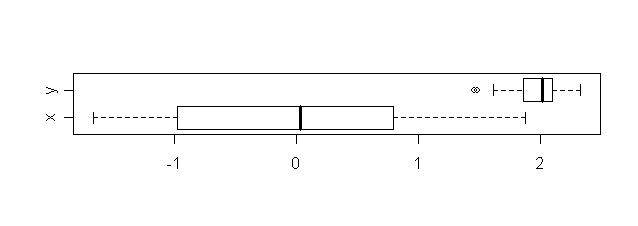 |
| Boxplots for the two data sets |
It requires some knowledge to interpret a boxplot (often called a
box-and-whiskers plot). The following diagram might help.
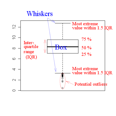 |
| An annotated boxplot |
Let us use the boxplot function on our data set.
boxplot(Vmag)
Boxplots are usually more informative when more than one
variable are plotted side by side.
boxplot(hip)
The size of the box roughly gives an idea about the spread of the
data.
|
| | |
|
Boxplots are not supposed to be terribly informative, but
they are often handy for obtaining a rough idea about a data set.
| |
| | |
|
Scatterplots
Next let us make a scatterplot.
plot(RA,DE)
This produces a scatterplot, where each pair of values is
shown as a point. R allows a lot of control on the appearance of
the plot. See the effect of the following.
plot(RA,DE,xlab="Right ascension",ylab="Declination",
     main="RA and DE from Hipparcos data")
You may change the colour and point type.
plot(RA,DE,pch=".",col="red")
Sometimes it is important to change the colours of some
points. Suppose that we want to colour red all the points with
DE exceeding 0. Then the ifelse
function comes handy.
cols = ifelse(DE>0,"red","black")
cols
This means "cols is red if DE>0, else
it is black".
plot(RA,DE,col=cols)
You may similarly use a vector for pch so that
different points are shown differently. There are many other
plotting options that you can learn using the online help. We
shall explain some of these during these tutorials as and when
needed.
|
| | |
|
To learn about the different plotting options in R you need to
look up the help of the par function.
?par
It has a long list of options. Before attempting to make your first
publication-quality graph with R you should better go through
this list.
| |
| | |
|
| Exercise:
Make a scatterplot of RA and pmRA. Do
you see any pattern?
|
Instead of making all such plots separately for different pairs
of variables we can make a scatterplot matrix
plot(hip,pch=".")
Histograms
Histograms show how densely or sparsely the values of a variable
lie at different points.
hist(B.V)
The histogram shows that the maximum concentration of values
occurs from 0.5 to 1. The vertical axis shows the number of
values. A bar of height 600, standing on the range 0.4 to 0.6,
for example, means there are 600
values in that range. Some people, however, want to scale the
vertical axis so that the total area of all the rectangles is 1.
Then the area of each rectangle denotes the probability of its
range.
hist(B.V,prob=T)
Multiple plots
Sometimes we want more than one plot in a single page (mainly to
facilitate comparison and printing). The way to achieve this in
R is rather
weird. Suppose that we want 4 plots laid out as a 2 by 2 matrix
in a page. Then we need to write
oldpar = par(mfrow=c(2,2))
The par function sets graphics options that determines
how subsequent plots should be made.
|
| | |
|
The par function controls the global graphics set up. All
future plots will be affected by this function. Everytime it is
called the old set up is returned by the function. It is a
good idea to save this old set up (as we have in a variable called
oldpar) so that we can restore the old set up later.
| |
| | |
|
Here mfrow
means multi-frame row-wise. The vector
c(2,2) tells R to use a 2 by 2 layout. Now let us
make 4 plots. These will be added to the screen row by row.
x = seq(0,1,0.1)
plot(x,sin(x),ty="l")
hist(RA)
plot(DE,pmDE)
boxplot(Vmag)
To restore the original ``one plot per page'' set up use
par(oldpar)
Adding to existing plots
Sometimes we want to add something (line, point etc) to an
existing plot. Then the functions abline, lines
and points are useful.
plot(RA,DE)
abline(a=-3.95,b=0.219)
This adds the line y = a + bx to the plot. Also try
abline(h=0.15)
abline(v=18.5)
To add curved lines to a plot we use the lines
function.
x = seq(0,10,0.1)
plot(x,sin(x),ty="l")
lines(x,cos(x),col="red")
We can add new points to a plot using the points
function.
points(x,(sin(x)+cos(x))/2,col="blue")
There are more things that you can add to a plot. See, for
example, the online help for the text and rect
functions.
Extracting the Hyades stars
Sometimes we have to work with only a subset of the entire
data. We shall illustrate this next by
selecting only the Hyades stars from the data set.
To do this we shall use the facts
| This are borrowed from Prof Hunter's notes, where he uses astronomy
knowledge to obtain these conditions by making suitable
plots. The interested reader is encouraged to look into his notes
for details. |
that the Main Sequence Hyades stars have
RA in the range (50,100)
DE in the range (0,25)
pmRA in the range (90,130)
pmDE in the range (-60,-10)
e_Plx <5
Vmag >4 OR
B.V <0.2 (this eliminates 4 red giants)
Let us see how we apply these conditions one by one. First, we
shall attach the data set so that we may access each
variable by its name.
attach(hip)
Next we shall apply the conditions as filters.
filter1 =  (RA>50 & RA<100 & DE>0 & DE<25)
filter2 = (pmRA>90 & pmRA<130 & pmDE>-60 & pmDE< -10)
filter3  =  filter1 & filter2 & e_Plx<5
HyadFilter = filter3 & (Vmag>4 |B.V <0.2)
The & denotes (as expected) logical AND
while the vertical bar | denotes logical OR.
We are going to need this filter in the later tutorials. So it is
a good idea to save these lines in a script file called, say,
hyad.r.
By the way, the filters are all just vectors of TRUEs and
FALSEs. The entry for a star is TRUE if and
only if it is a Hyades star.
Now we shall apply the filter to the data set. This produces a
new (filtered) data set which we have called
hyades. Finally we attach this data set.
hyades = hip[HyadFilter,]
attach(hyades)
You'll see a bunch of warning messages when you attach
the filtered data set. This is because the old (unfiltered)
variables are now being superceded by the new
(filtered) variables of the same name.
R always issues a warning whenever a variable from a new data set
clashes with some existing variable of the same name. This prevents
the user from accidentally changing a variable. In our case,
however, we did it deliberately. So we can ignore the warning.
All subsequent command will work with only Hyades stars.
dim(hyades)
plot(Vmag,B.V)
We shall often work with the Hyades stars in the later
tutorials. So let us save in a script file hyad.r the commands to
extract the Hyades star.