Principal Component Analysis
A simple example
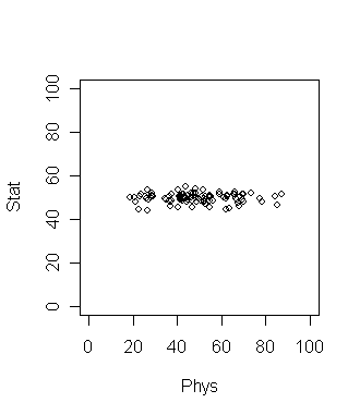
Consider 100 students with Physics and Statistics grades shown in
the diagram below. The data set is in marks.dat.
If we want to compare among the students which grade should be a
better discriminating factor? Physics or Statistics? Surely
Physics, since the variation is larger there. This is a common
situation in data analysis where the direction along which the data
varies the most is of special importance.
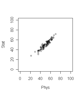
Now suppose that the plot looks like the following. What is the
best way to compare the students now?
Here the direction of maximum variation is like a slanted straight
line. This means we should take linear combination of the two
grades to get the best result. In this simple data set the
direction of maximum variation is more or less clear. But for
many data sets (especially high dimensional ones) such
visual inspection is not adequate or even possible! So we need
an objective method to find such a direction. Principal
Component Analysis (PCA) is one way to do this.
dat = read.table("marks.dat",head=T)
dim(dat)
names(dat)
pc = princomp(~Stat+Phys,dat)
pc$loading
Notice the somewhat non-intuitive syntax of the
princomp function. The first argument is a so-called
formula object in R (we have encountered this beast in the
regression tutorial). In princomp the first argument
must start with a ~ followed by a list of the variables
(separated by plus signs).
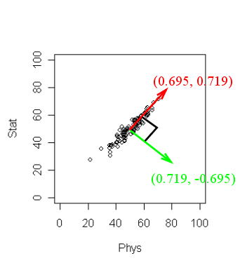
The output may not be readily obvious. The next diagram will
help.
R has returned two principal components. (Two because we
have two variables). These are a unit vector at right angles to
each other. You may think of PCA as choosing a new coordinate system
for the data, the principal components being the unit vectors
along the axes. The first principal component gives the direction
of the maximum spread of the data. The second gives the direction
of maximum spread perpendicular to the first direction. These two
directions are packed inside the matrix
pc$loadings. Each column gives a direction. The
direction of maximum spread (the first principal component) is in
the first column, the next principal component in the second and
so on.
There
is yet more information. Type
pc
to learn the amount of spread of the data along the chosen
directions. Here the spread along the first direction is 12.40.
while that along the second is much smaller 1.98. These numbers
are often not of main importance, it is their relative magnitude
that matters.
To see all the stuff that is neatly tucked inside pc
we can type
names(pc)
We shall not go into all these here. But one thing deserves
mention: scores. These are the projections of the
data points along the principal components. We have already
mentioned that the
principal components may be viewed as a new reference frame. Then
the scores
are the coordinates of the points w.r.t. this frame.
pc$scores
Higher dimensions
Most statisticians consider PCA a tool for reducing dimension of
data. To see this consider the interactive 3D scatterplot below.
It is possible to rotate this plot with the mouse. By rotating
suitably we can see that the cloud of points is basically
confined in a 2D plane. In other words, the data set is
essentially 2D.
|
| Drag the picture with the mouse
|
The same conclusion may be obtained by PCA. Here the first two
components will be along the plane, while the third will be
perpendicular to the plane. These are shown as the three lines.
Putting it to action
Now that we have seen how PCA can identify if the data cloud
resides in a lower dimensional space, we are ready to apply our
knowledge to astronomy. We shall work with the SDSS Quasar data
set stored in the file SDSS_quasar.dat.
First we prepare the data set for analysis.
quas = read.table("SDSS_quasar.dat",head=T)
dim(quas)
names(quas)
quas = na.omit(quas)
dim(quas)
Now we shall apply PCA.
pc = princomp(quas[,-1],scores=T)
The scores=T option will automatically compute the
projections of the data along the principal component directions.
Before looking inside pc let us make a mental note
of what information we should be looking for. We should look for
the loadings (which are 22 mutually perpendicular directions in a
22-dimensional space). Each direction is represented by a unit
vector with 22 components. So we have 22 times 22 = 484 numbers!
Whew! We should also know the spread of the data cloud along each
of the 22 directions. The spread along each direction is given by
just a single number. So we have to just look at 22 numbers for
this (lot less than
484). So we shall start by looking for these 22 numbers
first. Type
pc
to see them. Well, some of these are much larger than the
rest. To get an idea of the relative magnitudes, let us plot
them.
plot(pc)
Incidentally, this plot is often called a screeplot, and R
has a function with that name (it produces the same output as the
plot command).
screeplot(pc)
By default, the spreads are shown as bars. Most textbooks,
however, prefer to depict the same information as a line diagram:
screeplot(pc,type="lines")
The term ``scree'' refers to pebbles lying around the
base of a cliff, and a screeplot drawn with lines makes the
analogy clear. But one should not forget that the lines do not
have any significance. The points are the only important things.
We can see from the screeplot that only the first 2 components
account for the bulk. In other
words, the 22-dimensional data cloud essentially resides in just
a 2D plane! Which is that plane? The answer lies in the first two
columns of pc$loadings.
pc$loading[,1:2]
These give two mutually perpendicular unit vectors defining the
plane. To make sure that this is indeed the case you may check as
M = pc$loading[,1:2]
t(M) %*% M #should ideally produce the 2 by 2 identity matrix
You might like to project the entire data set onto this
plane.
plot(pc$scores[,1],pc$scores[,2],pch=".")
This is how the data cloud looks like in that magic plane in
22-dimensional space. And with my limited astronomy knowledge I
have no idea why these look like this!!! (An astronomy student
had once told me that this pattern has to do something with the
way the survey was conducted in outer space.)
Peeping behind the scree...
It may be of some interest to know how PCA works. We shall not go
into all the nitty gritty details, but the basic idea is not too
hard to grasp, if you know eigen values and eigen vectors.
What PCA does is, roughly speaking, computing the eigen values
and eigen vectors of the covariance matrix of the data. A
detailed exposition of why that is done is beyond the scope of
this tutorial. But we may use R's eigen analysis tools to hack a
rough imitation of princomp ourselves. We shall take
the students' grades data as our running example.
First compute the covariance matrix.
dat = read.table("marks.dat",head=T)
covar = cov(dat)
Next compute the eigen values and vectors:
eig = eigen(covar)
Now compare:
val = eig$values
sqrt(val)
pc = princomp(~Stat+Phys,dat)
pc
The values will not match exactly as there are more bells
and whistles inside princomp than I have cared to
divulge here. But still the results are comparable.
A better way
The princomp function is numerically less stable than
prcomp which is a better alternative. However, its
output structure differs somewhat from that for
princomp.
| Exercise:
Read the help on prcomp and redo the above computation
on the SDSS quasar data using this function. [Solution]
|