Time Series Analysis
Introduction
A time series is a data set collected over time where we suspect
some evolution with time. However, 10 CCD
bias plates taken over 5 minutes do not qualify as time series
data, because we do not expect to have any time-dependent signal
embedded in them. The
differences between the 10 images are purely random without any
temporal evolution. On the other hand for a
long 2-hour session we may very well suspect that the CCD is
drifting away from its ideal behaviour. So CCD biases taken every
15 minutes over 2 hours do constitute a time series.
A notation:
- Something that changes with time (t) is
denoted as a function f(t). We are all familiar with this
notation.
- Something that changes with chance is denoted by
f(w), where the symbol w stands for ``chance''. It
is just a notation, not a variable. In a sense w is
the sum total of all effects whose presence cannot be measured
but is felt.
- In a time series we have a quantity that changes both with
time as well as chance. So we use the notation X(t,w).
What is special about time series?
A very powerful weapon to tackle random variation is to take
repeated measurements. But for a time series that is not possible
because we cannot go back in time to take a fresh measurement of
past values. So we need different techniques. These techniques
start out by postulating a mechanism of how time and chance
influence the data.
- Role of time: This is usually determined by the
underlying physics where everything is assumed known except for a
few unknown parameters.
- Role of chance: Chance enters into the picture either
as intrinsic randomness (e.g., the experimenter's
ignorance or quantum phenomena) or as measurement error.
A simple situation: No intrinsic randomness
Here the sole randomness in the set up is due to measurement
errors. A commonly used model for this scenario is
where the form of the time-dependent part f(t) is governed by the physical
model. It is not random. The random error term e(w) is
assumed free of time. This assumption is reasonable when the
measuring instrument is calibrated frequently.
A popular example of such a model is the broken power law.
Broken power law
R does not have any ready made command to fit a broken power
law. So let us write one program to do so. Our running example
will use an IR data set about GRB030329 from Bloom (2003).
dat = read.table('bloom.dat')
The first column is time in days,and the second column is the
magnitude.
x = log(dat[,1])
y = dat[,2]
plot(x,y)
First we shall choose
a break point say at (A,B). Then we shall fit the best broken power law
(which is just a broken linear law after taking logarithm)
with the
knee at that point. Since we have already fixed the knee, all
that this fitting requires us to choose are
the two slopes to be used on the two sides of the knee.
For this we shift our origin to (A,B) by
subtracting A from x, and B from y.
To explain the steps we shall take (arbitrarily) A=1.5
and B=17. We shall soon learn how to choose
A and B optimally.
A = 1.5
B = 17
xnew = x - A
ynew = y - B
Next we pick all the points to the left of the knee
left = xnew < 0
xleft = xnew[left]
yleft = ynew[left]
Similarly, we also collect all the points to the right:
xright = xnew[!left]
yright = ynew[!left]
Next we have to fit a line through the origin (which is now
at (A,B)) to the left hand points, and then separately to the
right hand points. This will give us the best broken power law with
the knee constrained to be at (a,b).
leftfit = lm(yleft ~ xleft - 1)
rightfit = lm(yright ~ xright - 1)
How good is this fit? We can assess this visually by just drawing
the two lines.
leftslope = leftfit$coef
rightslope = rightfit$coef

abline(a=B - leftslope*A, b= leftslope,col='blue')
abline(a=B - rightslope*A, b= rightslope,col='red')
More objectively, the goodness of fit can be measured by the sum of the
squares of all the residuals.
sum(leftfit$resid ^ 2) + sum(rightfit$resid ^ 2)
We have to choose the knee position (A,B) to minimise this
error. A good way to proceed at this stage is to differentiate
the error w.r.t. B, equate the derivative to 0, and so
on. (Incidentally, the error is not differentiable
w.r.t. A.) But a quick way is to take a grid of values
for (A,B), compute the error for each value, and then
choose the minimum.
Here is some R code to implement this grid search.
agrid = seq(1.2,2.5,0.1)
bgrid = seq(15.5,19.5,0.1)
error = matrix(0,length(agrid),length(bgrid))
for(i in 1:length(agrid)) {
  for(j in 1:length(bgrid)) {
    A = agrid[i]
    B = bgrid[j]
    xnew = x - A
    ynew = y - B
    left = xnew < 0
    xleft = xnew[left]
    yleft = ynew[left]
    xright = xnew[!left]
    yright = ynew[!left]
    fitleft = lm(yleft ~ xleft - 1)
    fitright = lm(yright ~ xright - 1)

    error[i,j] = sum(fitleft$res ^ 2)+sum(fitright$res ^ 2)
  }
}
persp(agrid,bgrid,error)
Now we try to find the minimum error.
minpos = which.min(error)
row = (minpos-1)%%nrow(error)+1
col = floor((minpos-1)/nrow(error))+1
A = agrid[row]
B = bgrid[col]
Finally let's plot the fitted line.
plot(x,y)
points(A,B,pch=22)
xnew = x - A
ynew = y - B
left = xnew<0
xleft = xnew[left]
yleft = ynew[left]
xright = xnew[!left]
yright = ynew[!left]
leftslope = lm(yleft ~ xleft - 1)$coef
rightslope = lm(yright ~ xright - 1)$coef
abline(a=B - leftslope*A ,b= leftslope,col='blue')
abline(a=B - rightslope*A ,b= rightslope,col='red')
When intrinsic randomness is present
In most non-trivial problems intrinsic randomness is present, and
we cannot split X(t,w) simply into two parts, one
involving only t and the other involving only w. We
need a more complex way to combine the effects of t and
w.
In order to do this we need to have a clear idea as to the aim of
our analysis. Typically the two major aims are
- Understanding the structure of the series:
e.g., The period
of waxing and waning of the brightness of a star gives us
valuable information about exo-planets around it.
- Predicting future values: In many applications of
statistics (e.g., in econometrics) this is the primary
aim. But this is only of secondary importance in astronomy.
A case study: Sunspots
Understanding the structure of a time series primarily means
detecting cycles in it. Consider the sunspot data as an example.
dat = read.table("sspot.dat",head=T)
plot(ts(dat[,1],freq=12*12,start=c(1749,1)),ty="l",ylab="sunspots (monthly means)")
We can see a cyclical pattern. We want to find its period using
Fourier Analysis/Spectral Analysis. This is the fundamental idea
behind spectroscopy. But there is an important distinction
between that and what we are going to do now.
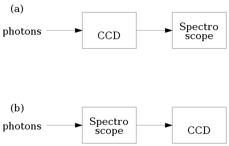
Consider the two configurations for using a
spectroscope. In (a) the photons are allowed
to impinge on the CCD first and the CCD signals are fed into the
spectroscope.
In (b) the light is first fed
to the spectroscope, and CCD comes after that.
We all know that the former configuration is of no practical
value, because CCD's are slow devices compared to frequency of
light waves. Thus CCD's lose all color information. So we need
to input the raw light to the spectroscope.
In our statistical analysis however we shall use the
configuration shown in (a). The spectroscope
here will be a software algorithm that needs numerical input.
We shall be working with cycles of large enough periods, so that
the slow response of CCD's will pose no problem.
The basic math behind Fourier Transforms (or Fast Fourier
Transforms, as its commonly used efficient implementation is
called) is beyond the scope of this tutorial. We shall
nevertheless remind ourselves of the concept using a toy
example.
t = 1:200
y1 = sin(2*pi*t/20)
y2 = sin(2*pi*t/12)
y3 = sin(2*pi*t/25)

y123 = y1+y2+y3


par(mfrow=c(2,1))
plot(t,y1,ty="l")
plot(t,y2,ty="l")
plot(t,y3,ty="l")
plot(t,y123,ty="l")
Notice how irregular the plot of y123 looks even though it
is just a smooth mathematical function. Mere inspection has no hope of ever
finding that it is actually made of 3
different sinusoids!
Now we shall feed this into our software spectroscope.
par(mfrow=c(2,1))
sp = spectrum(y123)
plot(sp$freq, sp$spec, ty="l")
Observe how the 3 components clearly stand out now!
Now we are in a position to apply our software spectroscope to
the sunspot data.
dat = read.table("sspot.dat",head=T)
names(dat)
attach(dat)


plot(sspot,ty="l")
sp = spectrum(sspot)
plot(sp$freq,sp$spec,ty="l")
We are interested in the strongest period present. This is
indicated by the highest peak. We can find it by inspection, or
we may let R find it for us:
index = which.max(sp$spec)
1/sp$freq[index]
Unevenly sampled data
Its appealing mathematical properties notwithstanding, the Fast
Fourier Transformation suffers from one great drawback: its
expects the data points to evenly spaced along the time line. But
in an observational science like astronomy, where physical
conditions like clouds govern availability of data, such data sets are
extremely rare. Various modifications to spectral analysis have
been suggested to cope with this situation. We shall discuss one
of them here: the Lomb-Scargle approach, which is available as a
collection of R functions freely downloadable from the web. A
good reference for the implementation details is Numerical
Recipes in C by Press et al. To learn the details of
R version please see here.
The following example is taken from that page, and is explained there.
source("LombScargle.R")

unit = "hour" # hourly data
set.seed(19)    # make this example reproducible

time = sort( runif(48, 0, 48) )

Expression = cos(2*pi*time/24 + pi/3) # 24 hour period

M = 4*length(time) # often 2 or 4

# Use test frequencies corresponding to
# periods from 8 hours to 96 hours
TestFrequencies = (1/96) + (1/8 - 1/96) * (1:M / M)

# Use Horne & Baliunas' estimate of independent frequencies
Nindependent = NHorneBaliunas(length(Expression))

ComputeAndPlotLombScargle(time, Expression,
  TestFrequencies, Nindependent,
  "Cosine Curve (24 hour period)")
Prediction
Predicting a time series is not often the most important concern
in astronomy. Understanding the forces governing the dynamics of
a time series is of more importance to the observational
astronomer. Nevertheless prediction has its uses, and we shall
now learn about some techniques that are geared towards this
aim.
 |
 |  |  |
|
Any prediction technique needs to assume, fit and extrapolate
some temporal pattern based on the data.
It must be borne in mind that such a temporal pattern is purely
for the purpose of prediction. Trying to attach structural
significance to it may lead to misleading conclusions. Compare
the situation with that of approximating a smooth function with
splines. The coefficients used in the spline curves have usually
no physical significance.
| |
 | |  |
|
Holt-Winters method
This is a very simple (if crude) technique that assumes that the
time series is composed of a slowly varying signal plus a
cyclical fluctuation of known period plus random noise.
The Holt-Winters method is basically a tracking method that
tracks the signal and cyclical fluctuation over time using a
feedback loop. To understand the algorithm imagine how a robot
arm that is capable of only linear movement can trace a curve. It
makes a sequence of small linear steps updating the slope at each
point based on feedback from its sensor.
Similarly, the Holt-Winters method approximates a complicated time
series using a linear component and a cyclical term:
where the linear coefficients a,b and the cyclical term
st+h are automatically updated using three different
feedback loops. These three loops are controlled by three tuning
parameters alpha, beta and gamma.
These take values between 0 and 1. If a tuning
parameter is chosen to be FALSE then the corresponding
feedback loop is switched off. The following command, for
example, applies the Holt-Winters method to the sun spot
data without any cyclical term:
hw = HoltWinters(sspot, gamma = FALSE)
To predict the next 200 observations we can use
p = predict(hw,200)


par(mfrow=c(1,1))
ts.plot(ts(sspot),p,col=c("black","red"))
Of course, this is pretty silly prediction, since we suppressed
the cyclical fluctuations by force. A more reasonable prediction
may be had if we allow default values for all the three tuning
parameters (the defaults are not fixed values, they are computed
by R based on the data).
hw = HoltWinters(sspot)
Oops! R complains because it has no idea about the periodicity.
sspot = ts(sspot, freq=12*12)
hw = HoltWinters(sspot)
p = predict(hw,200)


ts.plot(sspot,p,col=c("black","red"))
This prediction looks much better. But it must be borne in mind
that it is a very crude method, and does not produce any error
bar. Its absolute simplicity makes it an ideal choice for
one-step-ahead predictions computed online (i.e., where
the prediction is updated at each step as more data arrive).
Box-Jenkin's method
The method that we are now going to learn is the most
popular statistical method of time series analysis, though its
applicability to problems in astronomy is somewhat limited. At the
heart of this method sits the somewhat tricky concept of a
stationary time series. We shall first acquaint ourselves
with this concept through some examples.
Stationarity
In all the time series models encountered so far we have some
idea about the temporal evolution of the series (like presence of
some linear trend and/or cyclical fluctuations etc). We usually
have such an idea from prior knowledge about the physical process
generating the data. If we are looking at the light curve of a
star with an exo-planet we expect to see periodic ups and
downs. But what if we do not have any such prior idea? Then we
assume that the distribution of the random variable X(t,w)
is free of t. Such a time series is
called stationary.
One must not forget that stationarity is not a property of the
data per se, rather it describes the state of background
information we have about the data. When we say
"a particular
time series is stationary"
we are saying that
"we have no background information that leads us to believe
that the random behaviour of the series evolves with time."
Considered superficially this may seem to indicate that there is
no useful temporal information in the series, and that no
meaningful prediction is possible. That this naive
interpretation is not correct is the most remarkable fact about
Box-Jenkins modelling. Before going into complications let us
realise this point using a simple example.
First consider some white noise, which is the simplest example
of stationary time series.
x = rnorm(100)
plot(x,ty='l')
Next let us apply a 3-point moving average to the white noise.
The following R code achieves this:
y = numeric(98)
for(i in 1:98) y[i] = mean(x[i:(i+2)])
The averaging introduces correlation among the y's. But
convince
yourself that they are still stationary.
plot(y,ty='l')
The plot shows
a somewhat regular wavy pattern that
might very well be exploited for the purpose of prediction.
This illustrates the oft encountered scenario where the
distribution does not evolve with time, but particular
realisations do!
AutoRegressive Moving Average (ARMA) model
Many time series data are modeled as
This rather hairy object is indeed less pretentious than it
looks. Here Xt is the value of the series at time t. The model
says that part of the randomness in Xt comes from its
dependence on the past values: Xt-1,...,Xt-p; and
the rest comes from fresh
random errors εt,...,εt-q from now and the q most recent time points.
Viewed in this light, the model (which bears the impressive
name ARMA(p,q)) says what is applicable in general to most
time series. Exactly how the past X's and
the ε's influence Xt is governed by the
coefficients φ's and θ's, which we
shall estimate from the data. The only arbitrary part in the
model seems to the choice of p and q. While it is
reasonable to assume that Xt is influenced by the past
values Xt-1,...,Xt-p, how do we exactly
choose p? The same question may be asked for q.
To make informed guesses about p and q based on
data, one usually computes two functions called
the Autocorrelation Function (ACF) and Partial
Autocorrelation Function (PACF) from the data. Both these
functions have somewhat complicated formulae that do not shed much
light on their nature. So instead we shall take an intuitive
approach.
ACF
When we want to measure the degree of association between
two quantities a common method is to collect data about them, and
compute the correlation. Suppose that we are interested in
knowing how much association is there between an observation in a
time series and the observation immediately preceding it. The
simplest way would be consider all consecutive pairs in the time
series data, and compute the correlation based on them. This is
basically what is done in time series analysis, and the resulting
correlation is called the autocorrelation at lag 1.
Had we paired each observation with the one 2 time points behind
it, then the resulting correlation would have been called
autocorrelation at lag 2.
The autocorrelation function (ACF) is a
function γ(h) for h=1,2,...
where γ(h) is the autocorrelation at lag h.
One main utility of the ACF is for guessing the value
of q. For an ARMA(0,q) model (which is also called
an MA(q) model) typically the first q values of the ACF tend
to be
large, while the remaining are smaller in comparison.
In practice it is often not clear at all how to decide which
ACF's are large and which are not. So the ACF only provides a
very rough guidance, that we shall learn to polish soon.
To compute
ACF for a time series data set we can use the acf
command as follows.
acf(sspot)
Well, here the ACF is dying out, but rather slowly. This is
indicative of p≠0 and q=0. We shall get a
further confirmation for
this guess when we consider the partial
autocorrelation function below.
PACF
Correlation measures association between two variables. However,
it does not tell us if the association is direct or indirect.
An example if indirect association is where two
variables X,Y are both associated with a common third
variable Z. For example, temperature (X) outside
the telescope may found to have association with the amount
(Y) of noise in the CCD. A scientist may guess that the
association occurs indirectly via the temperature (Z) of
the CCD unit. Merely finding the correlation between X
and Y is not enough to test the scientist's guess. We can,
instead, wrap the CCD unit in very good temperature control
system (making Z a rock-solid constant) and then
compute the correlation between X and Y. If now the
correlation drops down to zero, we indeed have reason to support
the scientist's guess. The correlation we computed just now is
called the partial correlation between X
and Y fixing Z. It measures the association
between X and Y other than via Z.
In the context of time series we compute partial correlation
between Xt and Xt+h fixing all the X's
inbetween. This is the value partial autocorrelation function
(PACF) at
lag h.
Just as the ACF helps us to guess q, the PACF helps us
guess the value of p: the first p PACF's tend to be
larger than the rest.
The R command pacf computes PACF (surprise!).
pacf(sspot)
The two blue margins provide an aid to deciding whether a PACF
value is "large" or not. Values within or barely peeping out of
the margins may be considered "large", the rest being "small".
Our plot indicates that p=5 and q=0 might be good
guesses to start with.
Fitting the model
Once we have made a rough guess about p and q we
need to estimate the coefficients θ's
and φ's. The elaborate mathematical machinery
required for this is conveniently hidden from our view by
the arima command of R. Note the extra `i'
in arima. Actually R works with a more general
model
called ARIMA (AutoRegressiive Integrated Moving Average) of which
ARMA is a special case. Here is an example of
the arima command in use:
fit=arima(sspot,order=c(5,0,0))
Note the triple c(5,0,0). The first 5 is the value
of p, the last 0 is that of q. The middle 0 is not
used in an ARMA model (it is used in the more general ARIMA
model).
This rather benign-looking command launches a lot of computation
in the background, and if successful, dumps the results in the
variable fit.
There are various things that we can do with this
object. Possibly the first thing that we should do is to take a
look at what is inside it.
fit
How good is the fitted model?
But before we put it to any serious use like prediction, we
should better make sure that it is indeed a good fit. One way to
check this is by plotting the residuals:
plot(fit$resid)
Preferably the plot should show a series of small values without
any pattern. Any pattern in the residual plot indicates that the
fitted model
has been inadequate to explain that pattern. This is
the case here. The regular periodic fluctuations are too strong
to be called "patternless".
Polishing the model
What we do to remedy a bad fit depends heavily on the particular
data set, and is something of an art. We shall point out two
methods here:
Box-Cox transformation
The model fitting relies heavily on the normality of the data.
Let's check if that is a suspect here.
hist(sspot)
Well, the plot is extremely skewed. A simple remedy to cure
te skewness is to apply a Box-Cox transform to the data.
Box-Cox transforms constitute a family of one-to-one
(i.e., lossless) transforms that allow the user to
change the skewness present in a dataset. They are defined as
By choosing λ appropriately one may change
the shape of the histogram. Some trial and error are needed
before a good value of λ is found.
lambda=0.1; hist((sspot ^ lambda - 1)/(lambda-1))
Notice how we have used a ; as a separator to
pack two commands in one line.
This is useful when we want to replay multiple commands
repeatedly. Replay the line a number of times, each time
changing the value of λ. The value
0.35 looks like a good value. Let's repeat the
analysis with the transformed data:
sspot1 = (sspot ^ 0.35 - 1)/(0.35-1)
fit1 = arima(sspot1,order=c(5,0,0))
plot(fit1$resid)
Much better this time!
Comaparing models
One thing to try out
is to change p or q slightly and see if the fit
improves. This comparison is facilitated by the Akaike
Information Criterion (AIC) which is a summarisation of the
goodness of fit of the fitted model in terms of a single
number. If we have two competing models for the same data set,
then the one with the smaller AIC is the better fit. The command
to compute AIC in R for the fitted model stored
in fit is
AIC(fit)
AIC cannot be compared for models based on different data sets.
As a result there is no universal threshold against which to
rate a single AIC value on its own.
It may happen that no ARMA model fits the data at hand. In this
case we have to migrate to some different (and more complicated)
class of models. And above all, we must not forget that there are
just not enough types of models in statistics to fit all kinds of
time series data occurring in practice!